Ex 3.3 Introduction to Git & Creating Custom Datasets:
Objective: Clone a Git repository and use uv to set up its Python environment, then use the ScatterWidget from the drawdata library to create datasets by hand, convert them to pandas DataFrames, and analyze the correlation between x and y values.
- Clone the exercise template repository:
bash
1git clone https://github.com/willkapakos/Ex3.3.git- Then, move into the folder that was created:
bash
1cd Ex3.3- Run uv sync to install the dependency declared in the template’s pyproject.toml (drawdata, ipykernel, and pandas):
bash
1uv sync- Open the cloned Ex3.3 folder in VS Code, then open Ex3.3_ScatterWidget.ipynb and select the virtual envrionment that uv sync created as your kernel. See uv Package Manager if you need a refresher on selecting the appropriate kernel.
- Work through Parts 1 through 3 in the notebook and submit your completed Jupyter Notebook (.ipynb) file and the uv generated pyproject.toml file to the first quiz question on Canvas.
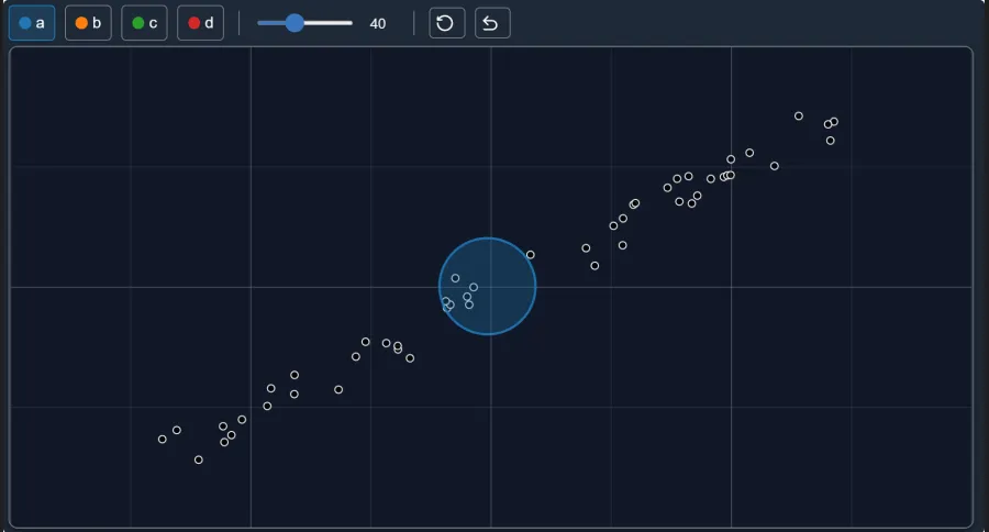
Part 1 (pre-drawn dataset):
- The first widget in the notebook is already populated with a fixed dataset, so this part is the same for everyone.
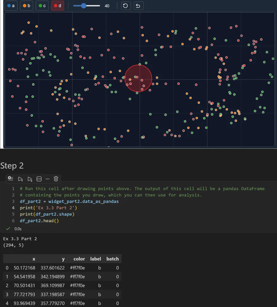
Part 2 (your own dataset — weak/no correlation):
- This widget starts blank. Draw data points scattered across the canvas with no clear trend.
- Because you’re drawing this by hand, your exact points (and row count) will not match the screengrab below exactly.
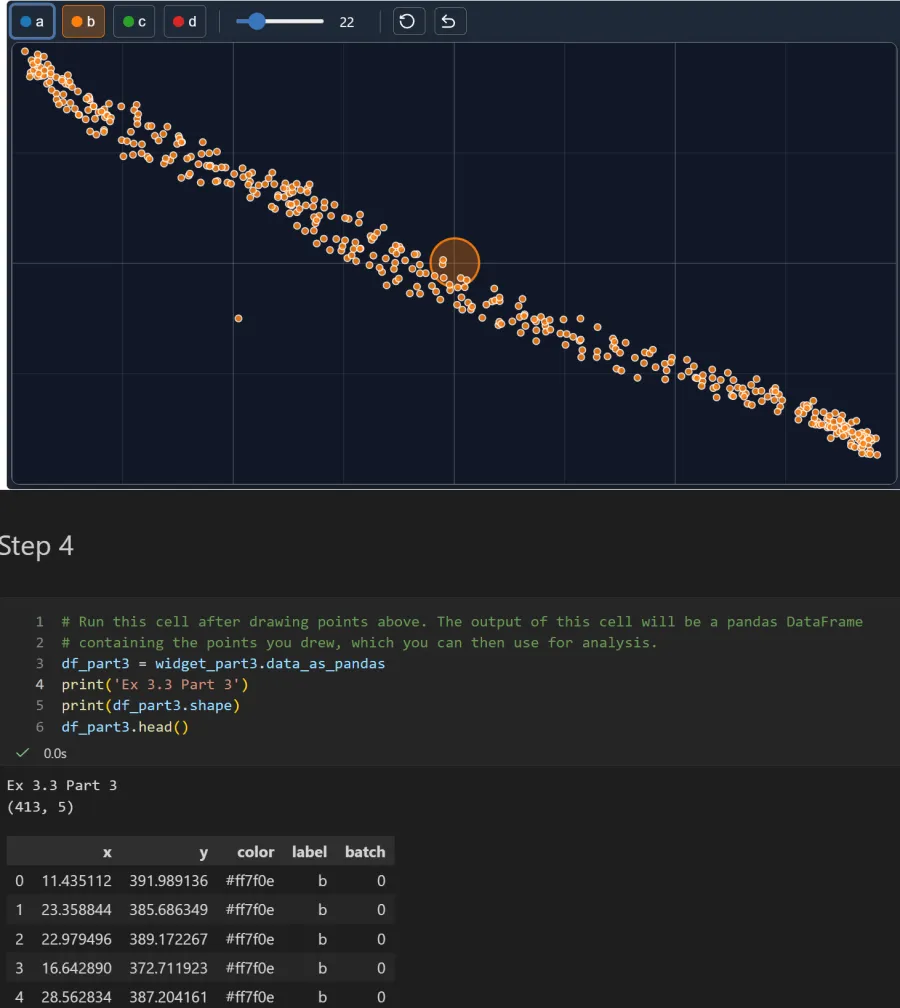
Part 3 (your own dataset — strong negative correlation):
- This widget also starts blank. Draw data points that trend downward and to the right (as x increases, y decreases).
- As in Part 2, your exact points will differ from the screengrab below.